Case Study—Ontario Parliament’s new landing pages and revised menu
Case Study—Ontario Parliament’s new landing pages and revised menu
My role
On this project I was the experience designer and visual design team lead. UX activities for this project were user research, information architecture, menu design and wireframing and validation of designs through user testing.
The Process
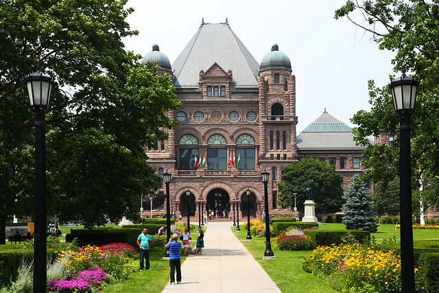
The Office of the Legislative Assembly provides non-partisan support to MPPs. The office is also the keeper of vast amounts of Legislative Data used by the public and legislative professionals.
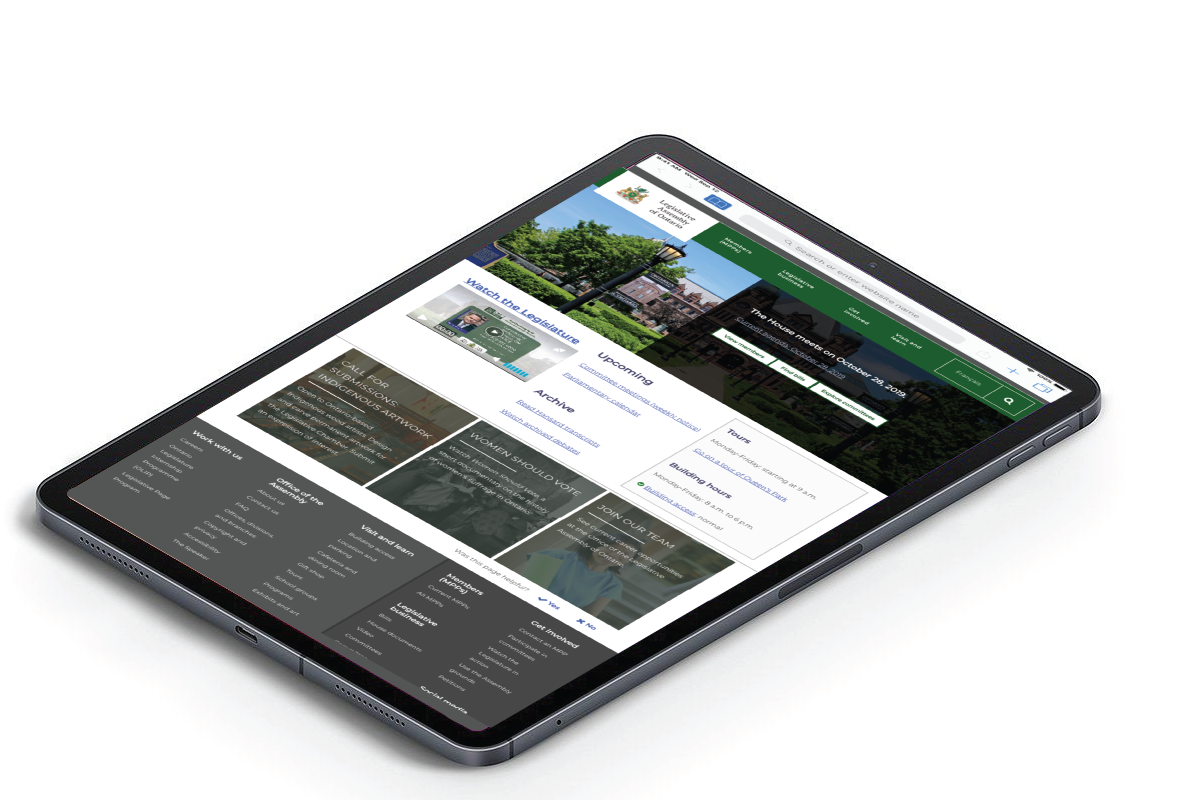
The project was to modernize the site, making it responsive, giving it a fresh new look and new, more usable navigation.
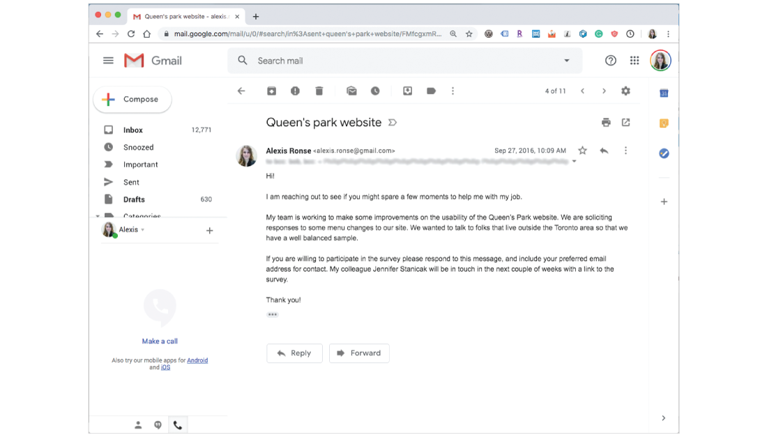
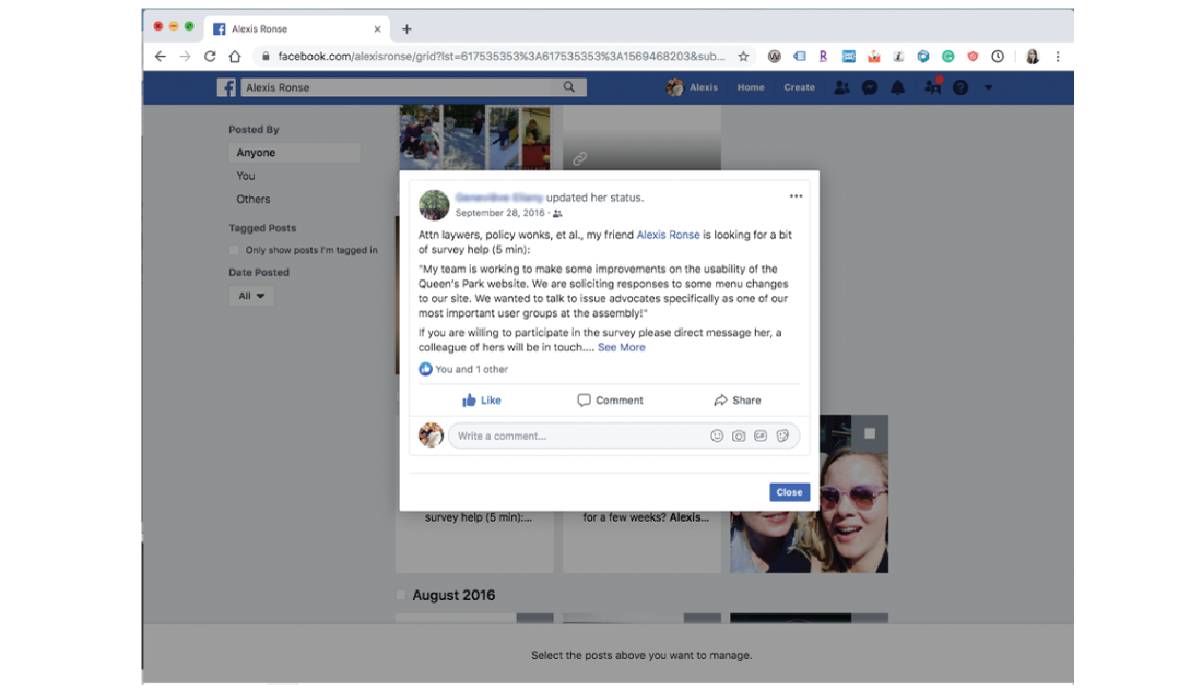
We started learning about our users the year before the project started by conducting some surveys and guerrilla testing of the previous site. We sent out emails to contacts and blasted our social media networks to recruit participants in our survey.
Prior to commencing the re-design project, we started to collect data on the old site for benchmarking.
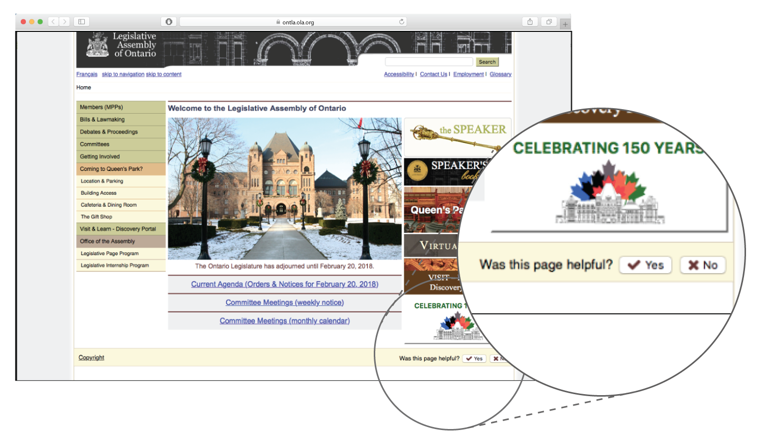
This micro-feedback survey was added to the footer of each page on the site. An optional further survey was promoted for users who clicked the micro feedback buttons.
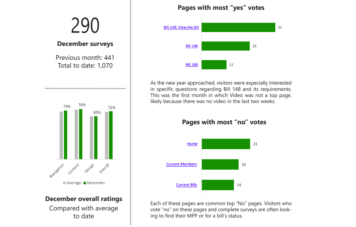
Analytics data showing the top pages on the site in early 2018.
Popular or controversial legislation is often some of the most popular content on the site, and these change over time as the work of the legislature moves forward. The highlighted pages are the non-bill, static pages.
Respondents self-identified into groups, confirming previously researched groupings.
Some early results from the footer survey.
We reached out to our email contacts to recruit users to test the proposed menu changes to the site.
We also solicited our social networks to recruit policy and legal professionals for user testing.
From our outreach efforts we were able to recruit a number of different user types for testing navigation language.
One of the things we learned was that for the majority of users 'Legislative business' is more meaningful than 'Parliamentary business'
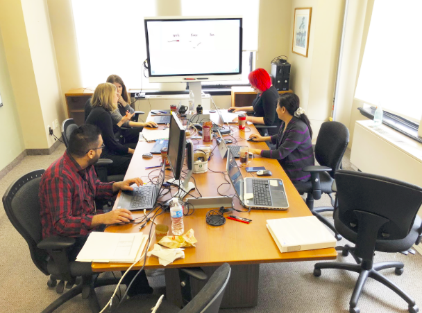
Together with digital content producers we strategized content, revised the navigation and roughed out the wireframes.
Previous research had determined that the users of the site were mostly Ontarians but not exclusively from Ontario. Also web visitors were both francophone and anglophone. The groupings that became the personas were students, teachers, interested citizens, legislators and researchers.
Goals for each of these user groups varied widely; people using our site for research ranged from legislative professionals to grade 6 students. We had both teachers and tourists seeking to visit the grounds. We had experienced activists and interested citizens getting involved with causes. Each of these user flows needed to be considered when desiging the new menu and landing pages for our site.
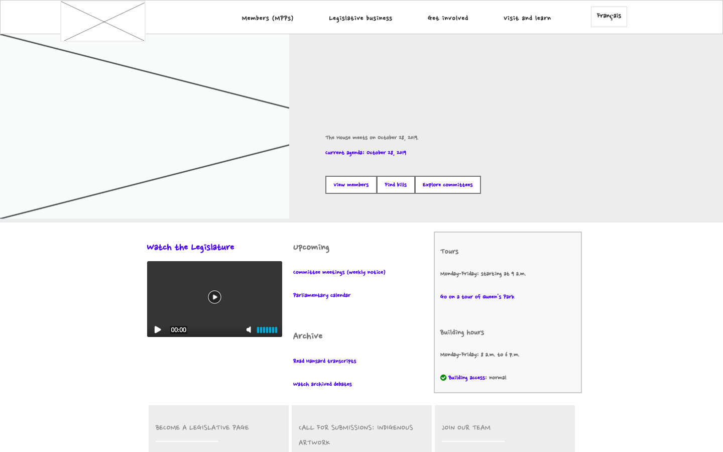
The new navigation has top level pages that highlight some of the most visited pages as determined by the analytics. These include, the 'Members' and 'Legislative Business' (Bills, Votes, etc) pages. Also included are links to top pages for smaller but important user groups, tourists and teachers.
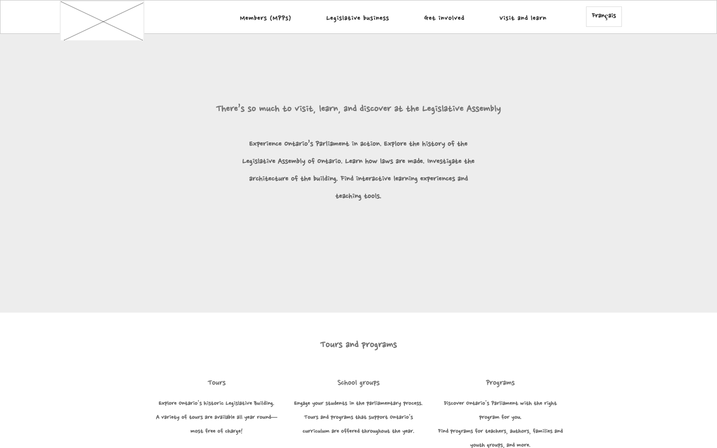
The 'Home' page features upcoming legislative business, so people can check in and see what is on the books for this week. There is also an area for promoting tours, programs, and other time bound offerings.
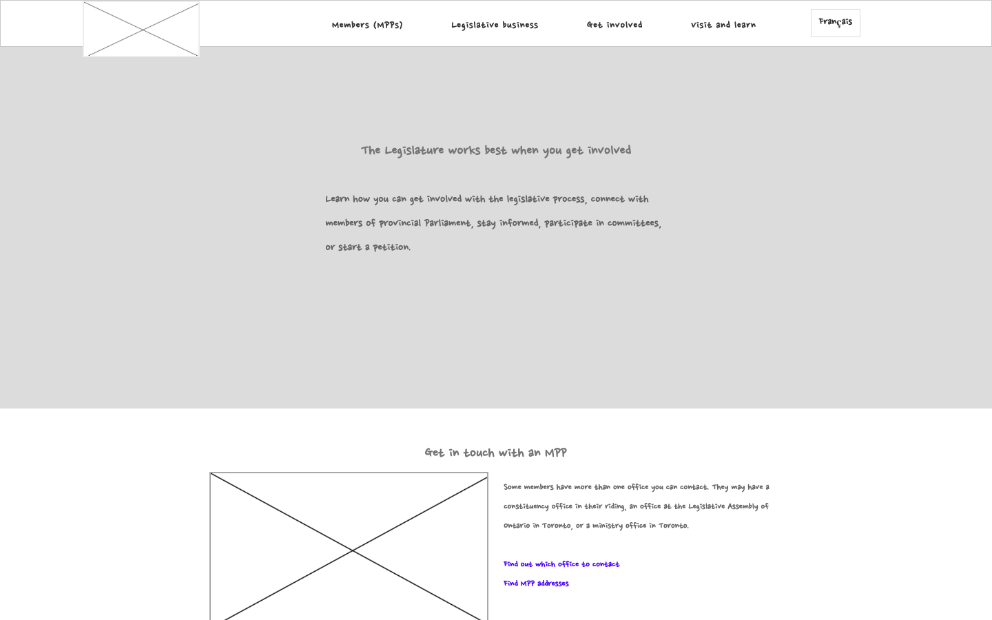
One of the objectives of the Office of the Legislative Assembly is to support democratic processes by encouraging the people of Ontario to get involved with the work of the legislature. On the 'Get Involved' page, information on participating in committees and creating petitions is promoted. Also included are three ways to watch the legislature; including multiple pathways increases access to the proceedings for geographically remote users or users with different levels of digital literacy.
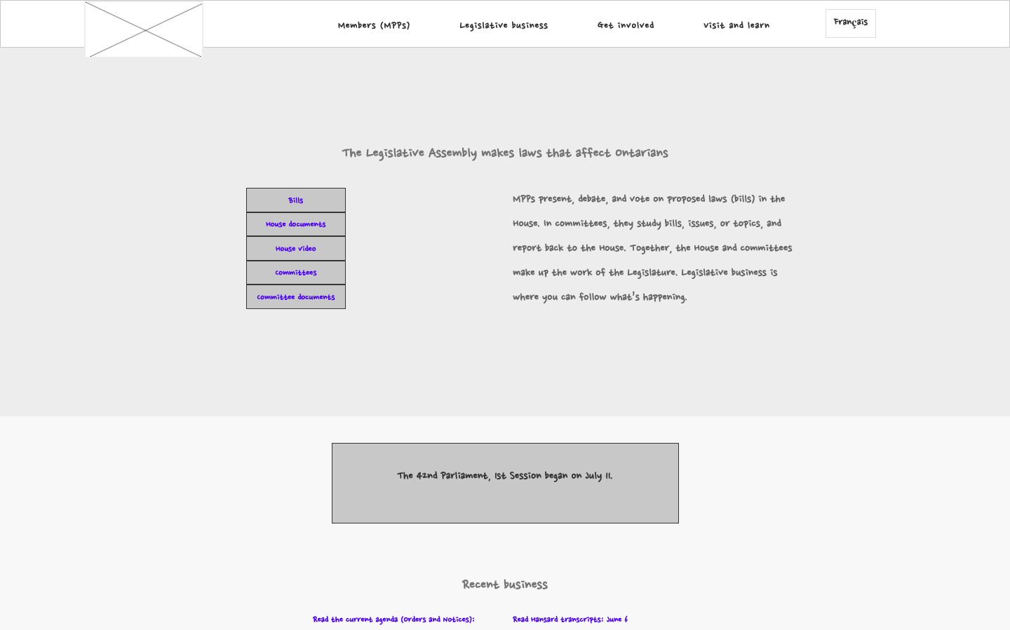
The 'Legislative Business' page the entry point to the vast repository of legislative documents at the assembly. This page features quick access to bills currently in debate, as well as the accompanying house documents.
For experienced professional users such as researchers, there are entry points to historical documents and quick links.
For users that are new to legislative processes, there are some explanatory materials that break down some of the jargon (Hansard, private vs. public bills, standing orders, etc). There are also didactic materials that help users to explore topics such as 'How a bill becomes law' and the 'Chamber seating plan'.
The 'Visit and Learn' page engages the tourist and teacher user groups. On this page, time constrained educational programs are highlighted so that visitors can easily discover them. Maps, directions and parking information are also featured as research determined these be top concerns for our tourist user group.
The 'Careers' page conveys the values of the assembly: integrity, inclusiveness, collaboration and excellence. This page uses icons, photography and copy to create awareness and interest on the part of potential applicants.
Outcomes and lessons learned
One of the challenges of this project was that during the build phase, there was a fixed deadline and scope change, which increased the load on the team. I was privileged to be part of a strong team that got even stronger through this challenging time.
17% increase in satisfaction levels on the navigation
13% increase in satisfaction levels on content
15% increase in satisfaction levels on design
From the year over year metrics from before the launch to after, the page satisfaction levels went from mostly negative to mostly positive.
In fact, the ratio of responses inverted; and went from being 63% negative to 63% positive.
From the year over year metrics showed that the page satisfaction levels went from mostly negative to mostly positive after the site launched.
In fact, the ratio of responses inverted; and went from being 63% negative to 63% positive.