Case study—Application form overhaul
Case study—York University Application Form
My role
As the primary designer and researcher for this project, my tasks included conducting interviews, synthesizing research, and creating research artifacts like the customer journey map. Design work included creating wireframes and prototypes which were later validated with users.
Process
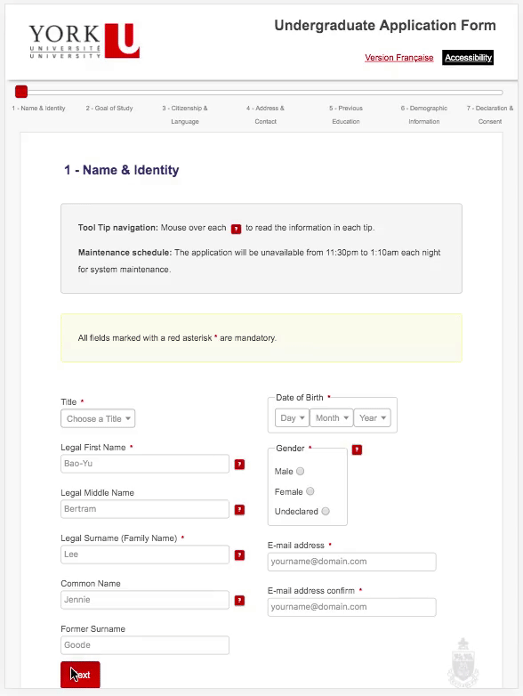
Stakeholder interviews helped us to identify the target audience for the form. The primary user was a mature student—they had graduated from high school at least 2 years ago. Staff conveyed the many difficulties students were having with the application process, leading to a high volume of support calls to the Student Services Office. We also interviewed recent applicants to identify pain points with the existing application process. The main difficulties with the form were the volume of jargon, the unwieldy length, the errors from text formatting issues and that the form did not work on mobile.

View the Customer Journey Map for applying to York U.


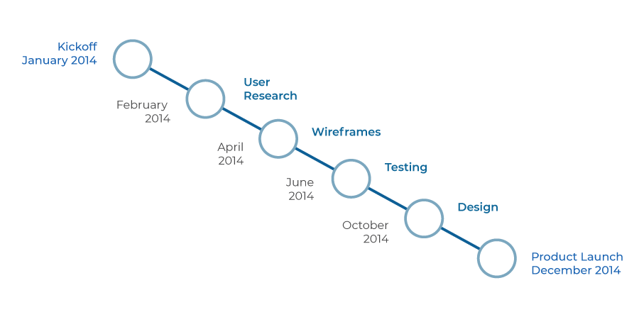
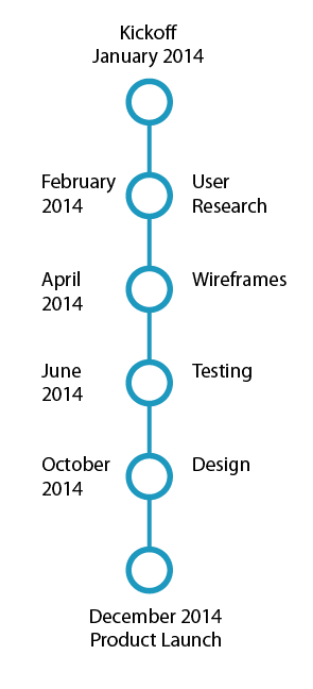
A cross-functional in-house team worked together over the course of 8 months to design, prototype and develop four versions of the form for graduate, undergraduate and french speaking applicants. User research, usability best practices and accessibility rules informed the development of the wireframes and prototypes.
Working with the existing infrastructure meant that there were technological limitations of the IT stack. We had to work within those limitations to create the form.
—Student feedback from the post-launch survey
Outcomes
From user testing we learned of several usability issues that we were able to fix before the launch.
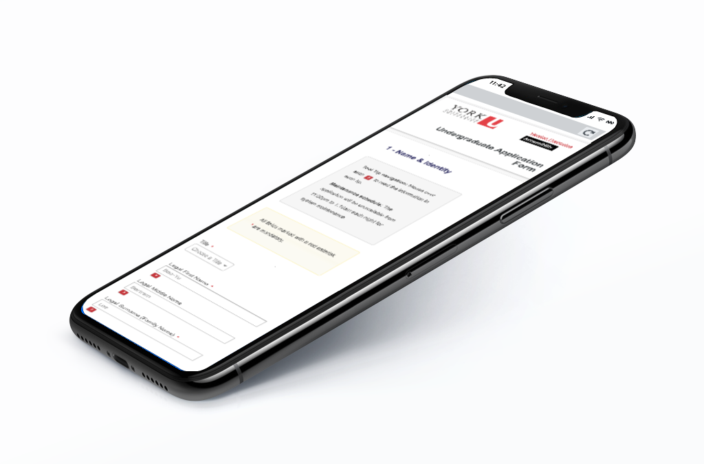
The resulting application form was newly accessible and mobile friendly, and had a much improved user experience.
Feedback from students and stakeholders was positive.